Codeless Factory
THE CHALLENGE
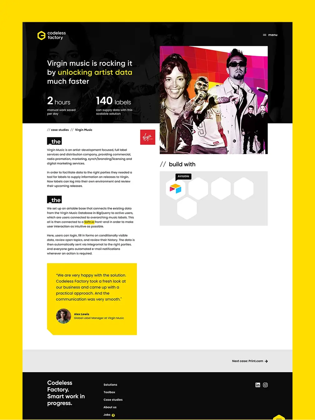
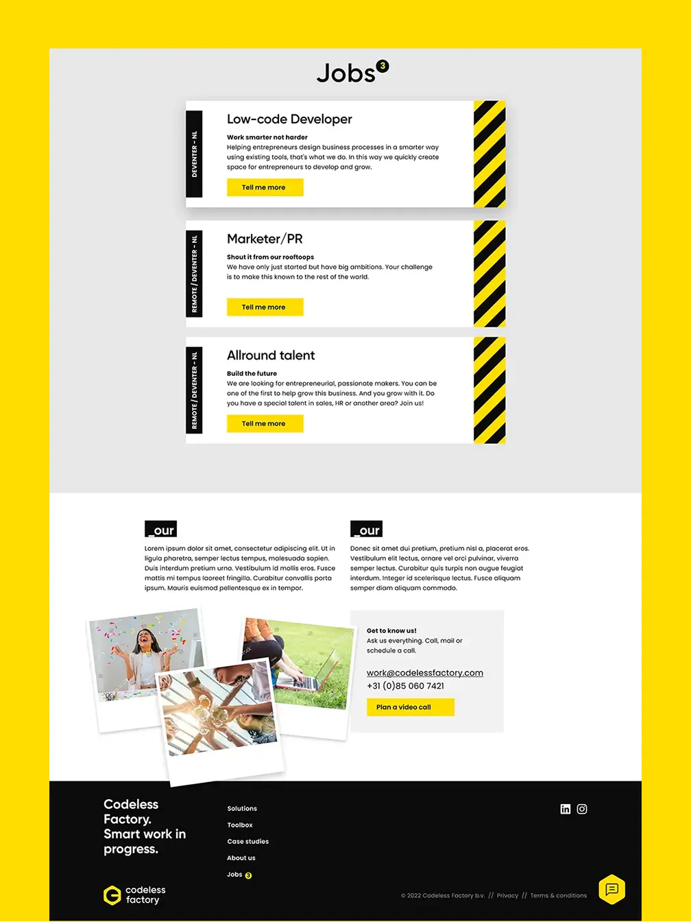
The identity I developed reflects exactly what Codeless Factory stands for: smart, pragmatic solutions for often complex processes.
SERVICES
brand strategy
visual identity
promotion
user interface design


visual identity
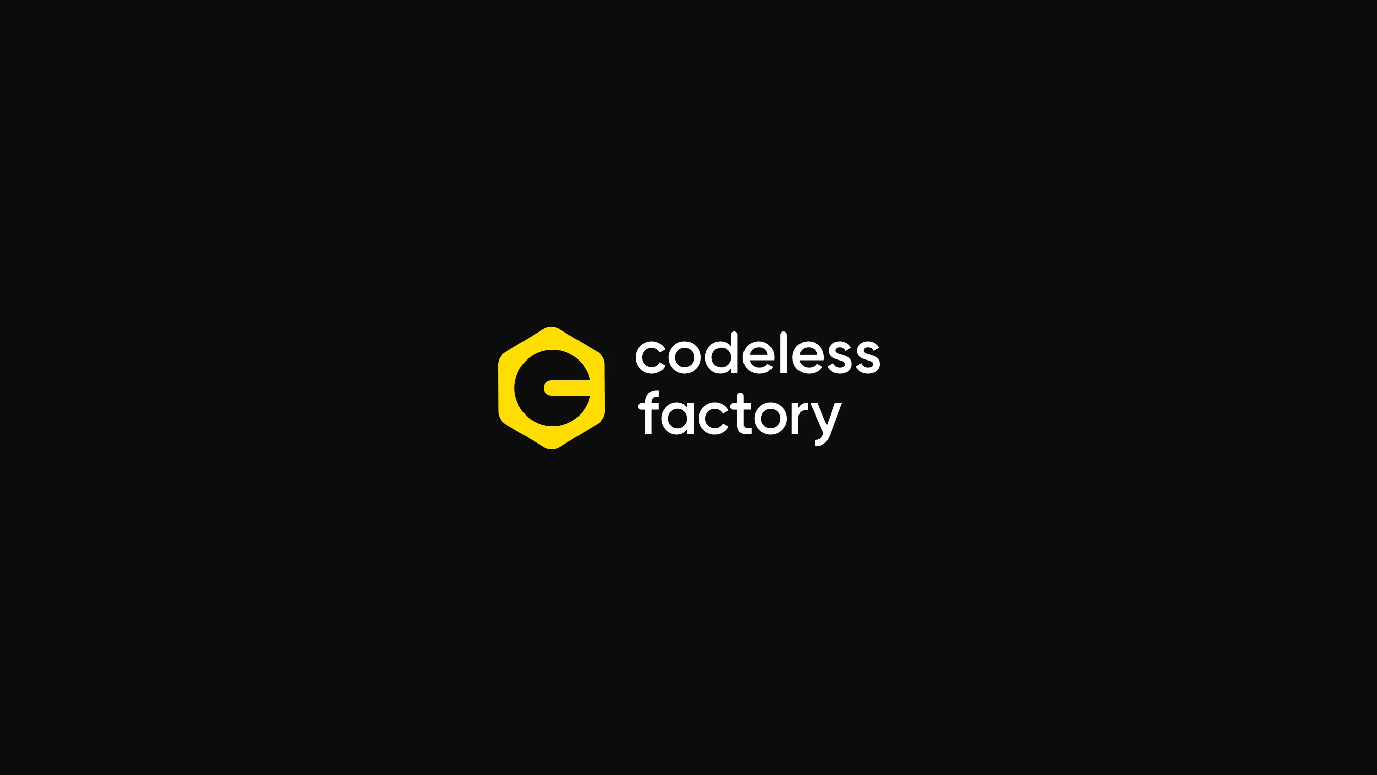
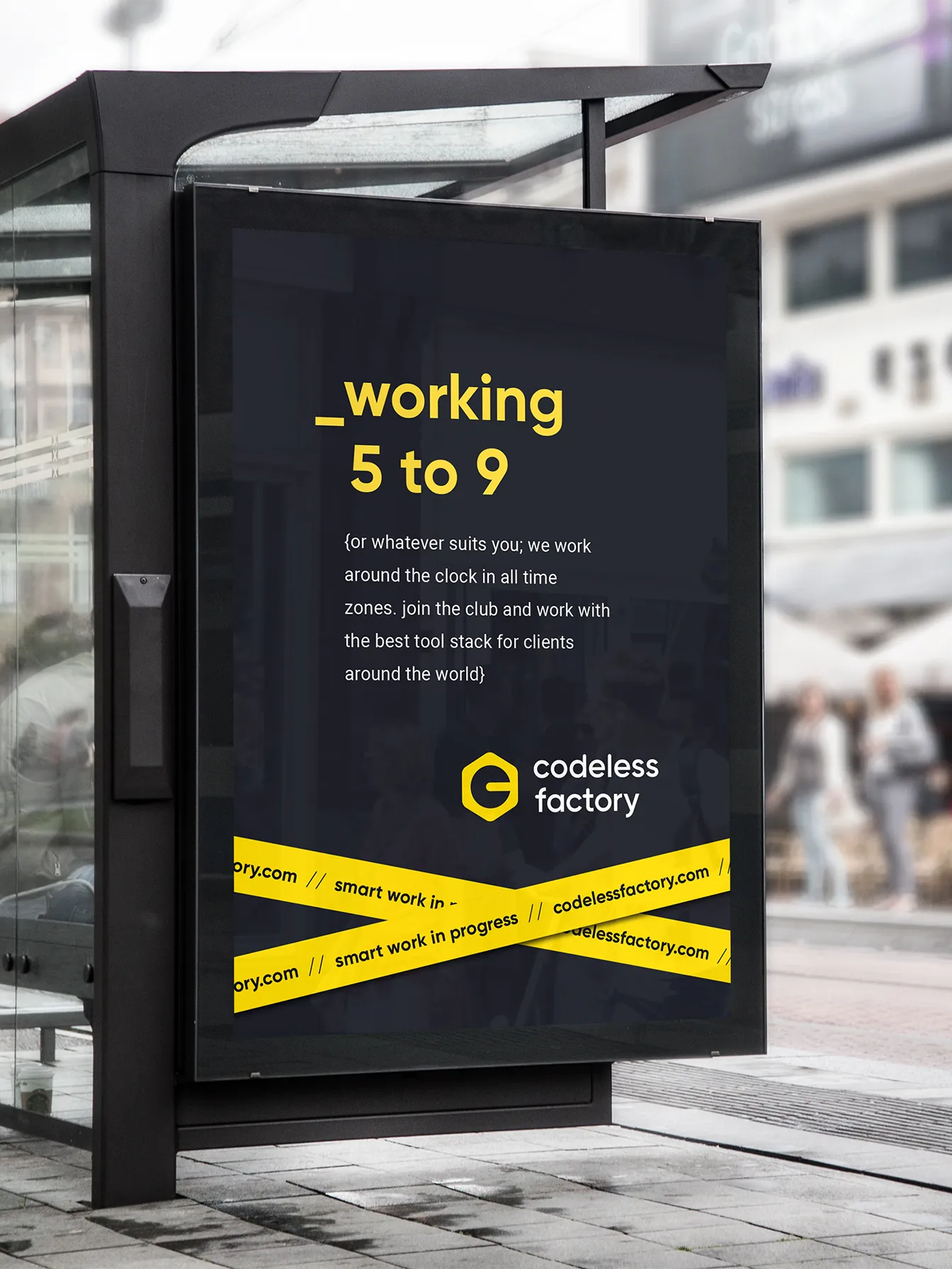
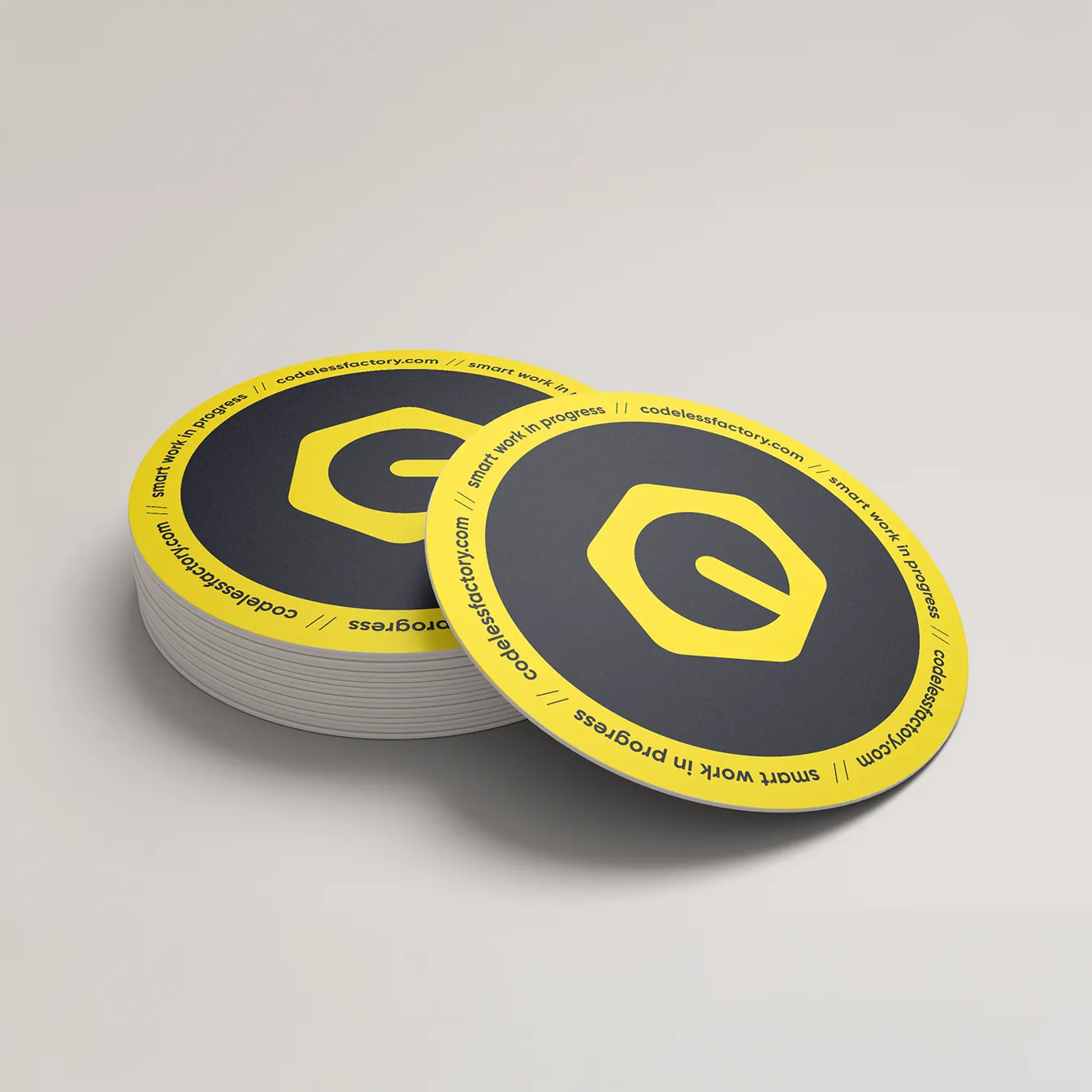
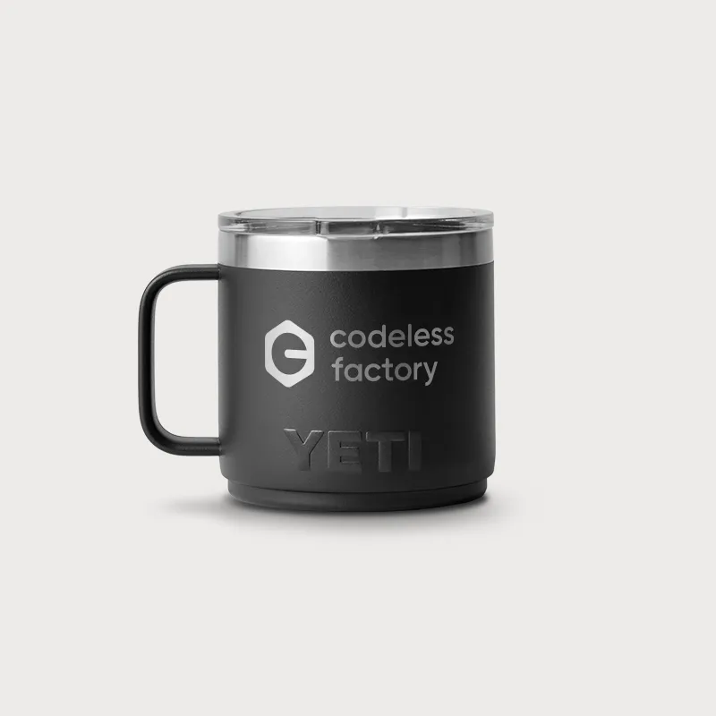
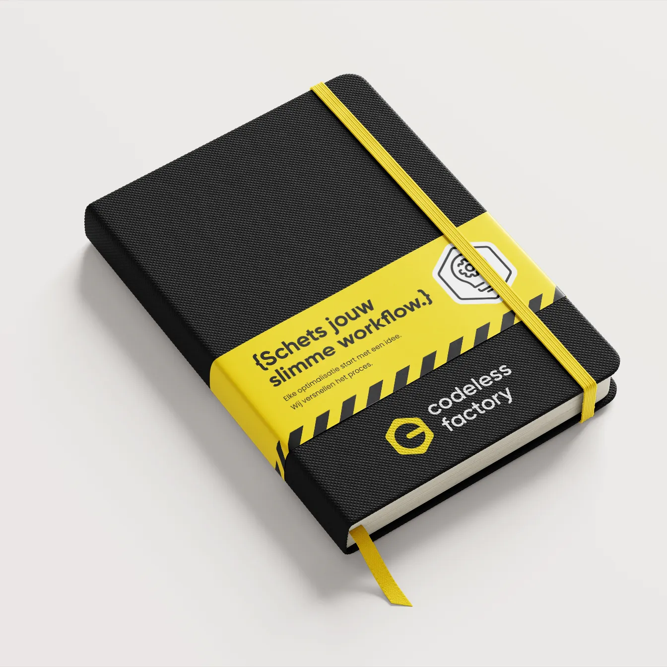
The symbol playfully nods to a hex nut, featuring a ‘C’ for Codeless and a minus sign representing ‘less code’. The yellow and black color palette creates a bold, industrial contrast, inspired by signage typically found in and around factories.


More than a visual identity, a tech brand that connects with clients and the team, and feels like a forward-thinking collective.
.webp)
.webp)